
“You’ll find,” he said, if I recall correctly, “that Negative Space carries a lot of visual weight. The subject therefore has to be very strong to balance out that 95% Negative Space.” A mentor was extolling the use of the broad, seemingly lacking in detail, surrounds of the main subject.
He went on, again as best I can recall, “Negative space helps the photo stay calm, and isolates the subject, and at the same time removes any interfering elements that distract from the view seeing what you are seeing.”
Great advice to a budding studio product photographer. After all a client doesn’t want a lot of competing visual elements, they want to see the product. And in particular, the product’s name, brand and model number (if applicable). If Mr Colgate couldn’t see the word “Colgate” in large letters on the subject, he would wonder how anyone would recognise his product, no matter how ‘creatively’ the subject was shown.
The same might be said of a certain cheese brand that is about to change its name. No matter that it was the brain child of a certain William Edward who’s family name now carries unfortunate connotations.
Ford Motor Company want to see their famed logo, and it is said the Coca Cola logo was one of the most recognised logos in the world. Now it seems the jury is out on the most recognised, but Google might be close to the top. At least when I googled, that is the result I got. 🙂
From a studio product point of view, getting the subject well lit, boldly presented and refreshingly isolated was always the big challenge. A small fill light here, a white card to be reflected in the strong sidelines of the product, a disappearing shadow to give depth, all against a plain backdrop.
But negative space is more than just a simple way of saying, ‘here is the subject’, it does, as my mentor suggested, carry a visual weight that needs to be carefully balanced by a subject. It reduces visual clutter and the minimalist approach welcomes a view to pause and reflect in a tranquil, welcoming way.
I have been I think, always a minimalist. Well, at least at heart. Preferring the simple to the complex visually.
Whether street, or field, or portrait, or product, I’ve always been happier to work with a subject against an uncluttered backdrop.
Most times, either here on the blog, or on Flickr, or my other web site, I try with the birds to provide as much detail as possible, preferring the closeup frame filling moment, rather than building a mystery or calmness or asking the viewer to pause and ponder, “Why there, why now, what was going on?”
So the past several weeks have been a bit intense, staying at home, (by preference) working through the photo library—it’s called Culling!
Removing those images that I am never going to pay the hostage price.
See Saturday Evening Post #87
And finding of course some photos that I’ve never spent time with, yet, hold a strong sense of graphic because of the smaller subject in its surrounds, or lack of them. Not always suitable as bird descriptive shots, but perhaps with a little work, suitable for Birds as Poetry.
Shots where the bird is almost inconsequential in the frame compared to the negative space.
It is true that I hadn’t been consciously working on that feel when I pressed the shutter, and it did require me to revisit to see the opportunity.
I’ve oft quoted my long-term friend and mentor John Harris. “You’ve got to look within the photo, to find the picture. Always look at the details, look at the obvious as there is always a highlight there somewhere, that others aren’t seeing. That is the diamond. Look for it always.” Thanks John.
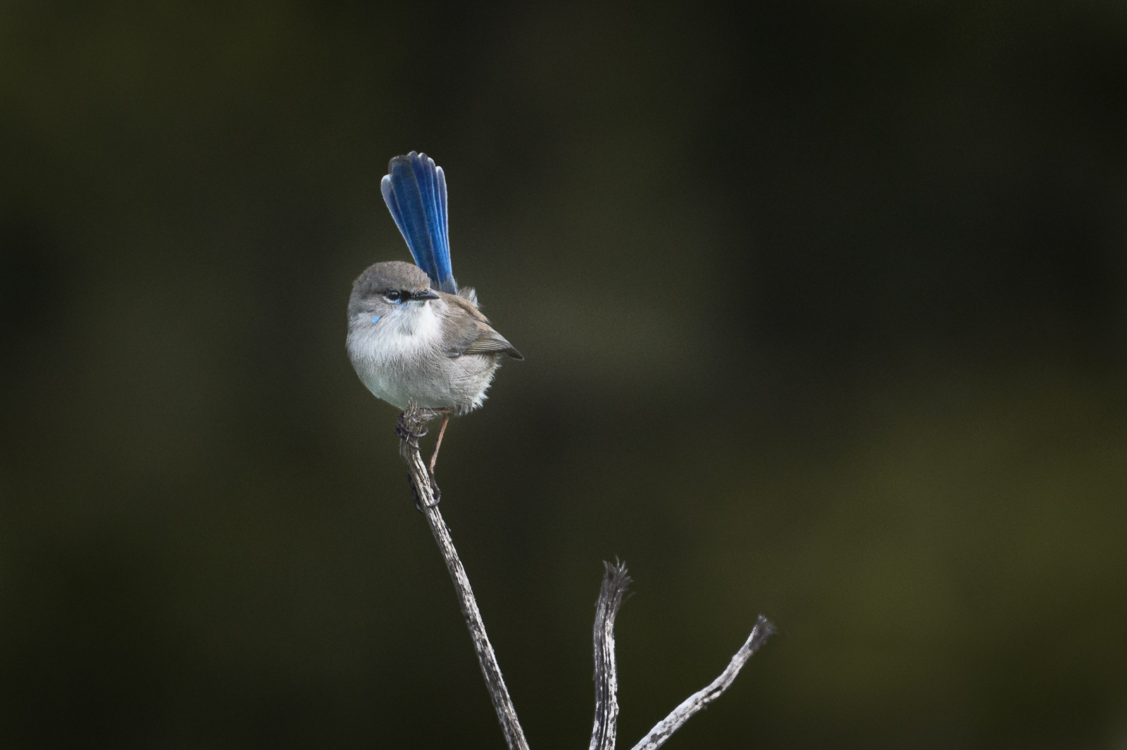
The ones that have got the creative juices flowing, are those that lend themselves to making the most of the negative space. I’ve shared a few on Flickr of late, and thought this very active male Superb Fairywren had made a strong enough compositional statement to balance the dark moody area behind him.
As he moults into his breeding colours he is ready to become the master of his new status, his balance of the negative space gives him a strength and purpose.
The Doona Hermit.
Remain.

Lovely shot! With a personality and attitude like that, there just isn’t room for anything else in the image! He definitely holds his own.
LikeLiked by 1 person
Thank you Eleanor, I’ve really enjoyed the time working with a selected range of shots such as this where the sheer presence of the bird can be emphasised.
LikeLike
A superb example of the effectiveness of negative space. An often useful tool in ‘the kit’. The Fairy-wren needs nothing to distract from him. I often find that viewers like a negative space image without realising why.
On a side note, I had a Swampie come over as I wandered home from the post office just before lunch time. All I had with me was the phone so achieved the ultimate negative space image, 100% blue sky! Oh well, perhaps it will fly this way again.
LikeLiked by 1 person
G’day David, I’m sure there is some science behind why we identify, or at least take note of large negative space images. It is partly because of the calming or inviting exploration without having to ‘slueth’ out the subject. But I think there must be more to how the large space attracts attention.
We have a pair of swans with 5 (as of yesterday) cygnets working in the MW run off pond near the Coles Supermarket on Tarneit Road.
I’m going to get game and take a camera on the next sunny day. It is my closest “Shopping” so I feel I’ll be ok with a mask.
LikeLike
Thanks David, it is true what you say, and your Fairy-wren certainly is a beautiful example. This is something I need to do more myself, as I tend to over crop many photos, and my son David often corrects me on this. I recently realised what you are sharing when I framed the White-cheeked Honeyeater in a recent post how stunning it looked in its smallness with the light on it amid the 95% void behind it. Thanks for sharing this interesting and helpful aspect of improving the aspect when framing photos of small birds. Sorry you guys are suffering for the foolishness of the few, it is not good here at the moment either, but not as bad as where you are. Stay safe and keep warm my friend.
LikeLiked by 1 person
Thanks for the thoughtful repy Ashley, and for sharing some of the challenges that making visuals work brings.
Normally I don’t spend a lot of time reworking the photo library, I usually move on to the latest and greatest. I can’t say that I took this with intent, I was impressed by the richness of his tail, and thought a shot was worth it.
Only recently have I begun to assemble a few more on the same vein.
The numbers here are quite unnerving at 459 today. The curve is flatter, not exponentially growing, so have to say at least for the medical people its somewhat manageable. The loss of life is brutal and I think it is bringing home the message even to the less inclinded to cooperate.
I am also annoyed with news reporting that highlights and makes urban heros out of the lawbreakers while not emphasising the good work of the majority. Bad news sells, no one cares for good news it seems.
In the meantime, we plod on, keep close to the doona, and smile a lot.
Remain
LikeLike
This is exactly how photography becomes poetry to the eyes, David.
Greetings…
LikeLiked by 1 person
Tis true Adam.
When I first started the blog it was an attempt to meet a challenge about visual poetry.
How as image makers we transcend the verbal and open up who we are.
Using less to say more.
*(Probably enough words in there for a quick Haiku 🙂 _
I’ve been reflecting since writing this particular blog, that I’ve taken a goodly number of shots like this one where the subject is but a small part of the frame, but have never really had time to explore how to get the best visually from them.
LikeLike
Hi Adam,
Just because you challenged me.
Inside
Lockdown gives the chance
to see within share without
Lasting benefits
LikeLike