Hotdiggity. We’re gunna commit photography.
After last week’s Saturday Evening Post #106, I felt like continuing with the voice behind the light photo skills exploration.
There are many studio lighting ‘sets’. One of the more challenging is sometimes referred to as the light of “Comic Book Villains”.
Split Lighting.
A variation of side lighting. A main light source is used at 90 degrees to the subject-camera plane. It provides light to one side of the subject, and shadow to the other side.
It is not the most flattering light for portraits.
But.
It does add its own feel of dark mood to the subject—hence the ‘villain’ nickname.
Split lighting has quite a number of moods to offer. One of the most useful is a feeling of conviction-assurance-confindence and sureness. It was used to great effect during the 1930s and 40s for movie starlets. A hint of mystery and intrigue.
More recently I’ve noticed its been used in movie posters for ‘action’ style stories.
Lord of the Rings, Casino Royale, Lethal Weapon 4, Parker just to mention a few. No, don’t watch them, I’m not doing movie reviews, just poster examples.
I once worked with a company that licensed the use of the Lethal Weapon 4 poster as an overlay for an entertainment centre experience. But. That is definitely another story.
It is also a very useful product in studio light, and has worked a treat for quite a number of car brochures. Both Apple and Samsung have used a variation recently for their offerings.
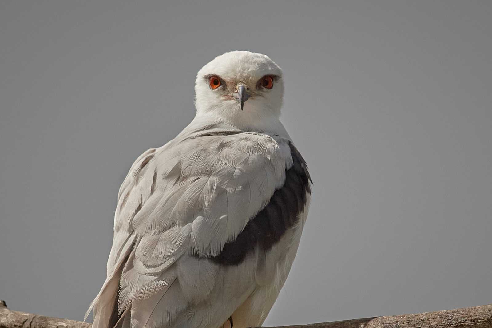
The one thing about it is that the subject is always facing square on to the camera. The other day we were out with some Black-shouldered Kites. The lighting was, well, overcast.
Porridge.
The grey sky was typical Rochester New York, 18% Grey. Now for those who don’t recall. Rochester NY was (is) the home of the Eastman Kodak Company, some may have heard of them, they used to manufacture stuff called filum.
They also produced a device to help determine correct exposure. The R-27 Kodak Neutral Test Card. One side was 90% reflectance, White. The other 18% Gray (note American spelling). It has been said that the 18% was chosen as it matched the grey skies of Rochester NY. It is not true that the sun never shines in Rochester, nor is it true that 18% reflectance is the average scene reflectance, but, tonight I won’t pursue that. Nor will I tell tales of the 8ft snow dump on the streets one winter.
The male has been named Bronson by my flickr mate, David Nice.
Bronson is a white and grey bird on a grey porridge sky. Think merge.
Then by one of those quirks of nature the clouds cleared momentarily and the early morning light brushed over Bronson’s side and he looked directly at me, and I had a Split Light subject and shot.
Gives him that awesome presence he deserves.
One frame was all I needed, and then porridge oozed back over and the moment was gone.

T’is indeed a stunning image, David! Split light has its uses. There was a bit of that going on down there this morning. All three chicks out. And natural split light in abundance, when I had any light at all, the cloud cover was variable from heavy to nothing. It is interesting to note the behavioural differences with this clutch too, including the tree and branches they are favouring – that gives great opportunity to ‘play’ with the light!
LikeLiked by 1 person
Yes, it is never the same, The summer grasses must make some difference in the way the mice family plan, and no doubt that affects the availablity for the kites. Last clutch were good as they stayed on the early morning light side. And also it was rising much further north on the horizon, now its almost a side light for much of the morning on that side.
LikeLike
Thanks David for a very interesting and practical post, with some great tips for giving mood to a photo. Love how it works for the Kite, especially since the photo naturally lacks contrast due to the sky. I have noticed in some of my own photos at times how this has improved them by displaying more character in the bird’s expression. Thanks again.
LikeLiked by 1 person
hello Ashley, thanks for dropping by.
Split does make for interesting portaits with a touch of mystery. Watch some of the old Earling Studios 1940-1950 movies to see it in action.
LikeLiked by 1 person
A beautiful image and an interesting essay on split lighting. I always look forward to your Saturday Evening Posts!
LikeLiked by 1 person
Thank you Eleanor, I do try to enjoy a more photo approach to the Saturday Evenings. Sometimes it writes itself, other times I have to go looking for it.
So much to learn.
LikeLiked by 1 person
Split Lighting. I’ve learned a lot and this was fun too.
And yes – just one frame of Bronson. Truly enlightening.
LikeLiked by 1 person
We are always learning, just knowing is not enough I think, have to find ways to make it work for our creative vision
LikeLike