Every so often, I look at the overall feel of the blog site and ponder how to make it more friendly and viewer effective.
I’ve been using the current template for a couple of years and have enjoyed the chance to let the images do most of the work on the blog. As they should.
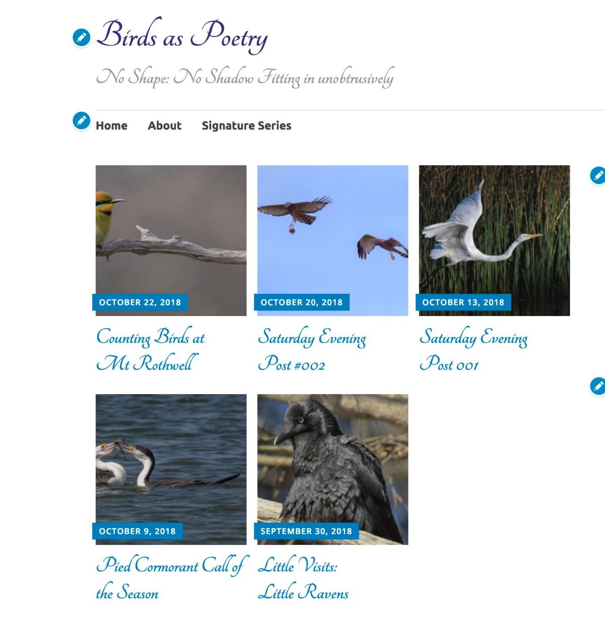
But the winds of change are coming to Birdsaspoetry.
I’m gearing up to turn the front page into small tiles of each post. That way its easier to see a Body of Work, rather than scroll down interminably to see what has been going on the past few months.
A challenge with the new style is what to do with all those sidebar, bottom bar additions. But, I suspect not to many rock on to the site expecting to see new stuff down there. So they may well diminish in number and it won’t be the first time I’ve dropped stuff off.
Here is a sneak preview of what it might look like.

Looks good to me.
LikeLike
Oh yes, that does look good. I am just back home after a couple of weeks in WA and this will let me go back easily to look again at posts on the big screen instead of my iPad mini!.
LikeLike